Modern Angular 09: Products Grid with Angular Material

This is lesson 9 of the Modern Angular Course. In the previous lesson, we set up Angular Material and created the application header. Now we have a basic app shell, so it is time to build the main feature of the page: the products list.
This post is part of the Modern Angular Course series. Check the course page for the full episode list.
In this post, we cover:
- The component structure for the products page
- How to create a reusable product card component with Angular Material
- How to build a responsive products grid using CSS Grid
- How to organize components by feature using folder structure
- Why we build UI first before adding data
Component Structure
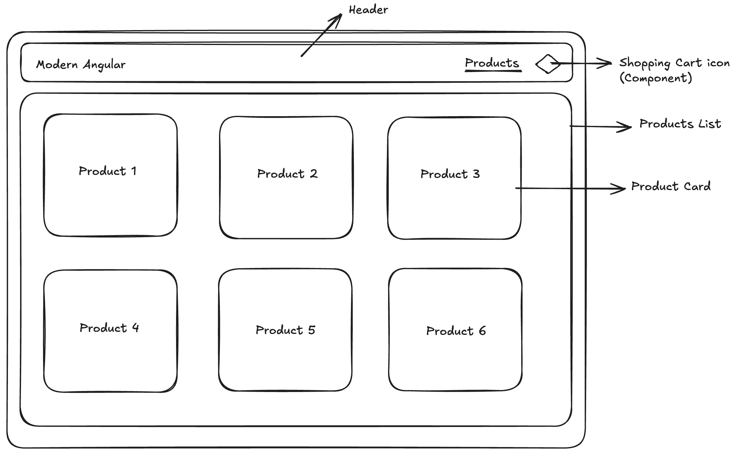
Before we start coding, let’s revisit the component structure we planned in the previous lesson.
We will create two components:
- A
ProductsGridcomponent — responsible for the grid layout - A
ProductCardcomponent — responsible for displaying a single product
You could put everything in a single component — the grid layout and the product details all in one place. It would work. But as the application grows, that component would quickly become harder to read, test, and maintain.
Instead, we follow the principle of separation of concerns: each component should have a single responsibility and remain as small and focused as possible. The grid component handles layout, the card component handles presentation. This makes our code easier to understand, reuse, and change independently.
Creating the Products Grid Component
Let’s start by creating the products grid component:
1
ng generate component products/products-grid
Or the shorthand:
1
ng g c products/products-grid
This component lives inside a products folder — grouping related components together keeps our project organized as it grows.
Why Group Components in Folders?
Organizing components by feature (like products/) is a widely recommended practice in Angular. It keeps related files close together, making the codebase easier to navigate and maintain.
If you have worked with older Angular versions, you might remember NgModules — where we grouped components, directives, and pipes into modules like ProductsModule. With standalone components (the default since Angular v17), NgModules are no longer required. However, the idea of feature-based organization still applies — we just do it through folder structure instead of module files.
This approach gives us the best of both worlds: clean organization without the boilerplate of NgModules.
Creating the Product Card Component
Since the product card is related to products, we place it in the same products folder:
1
ng generate component products/product-card
Or the shorthand:
1
ng g c products/product-card
This component will:
- Display a single product’s information
- Be reusable — we will render one card per product in the grid
- Accept product data as input (we will cover the
input()function in a future lesson)
For now, let’s focus on building the visual structure with placeholder content.
The Product Card Component Class
The component imports only the Material modules it needs:
1
2
3
4
5
6
7
8
9
10
11
import { Component } from '@angular/core';
import { MatButtonModule } from '@angular/material/button';
import { MatCardModule } from '@angular/material/card';

@Component({
  selector: 'app-product-card',
  imports: [MatCardModule, MatButtonModule],
  templateUrl: './product-card.html',
  styleUrl: './product-card.scss',
})
export class ProductCard {}
We import MatCardModule for the card layout and MatButtonModule for the button directive. Each component declares exactly what it needs in its own imports array — no shared modules, no global module files.
The Product Card Template
Now let’s build the card UI using Material components:
1
2
3
4
5
6
7
8
9
10
11
12
13
14
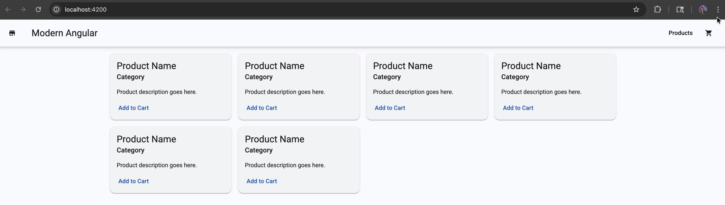
<mat-card class="product-card">
<mat-card-header>
<mat-card-title>Product Name</mat-card-title>
<mat-card-subtitle>Category</mat-card-subtitle>
</mat-card-header>
<mat-card-content>
<p>Product description goes here.</p>
</mat-card-content>
<mat-card-actions>
<button matButton>Add to Cart</button>
</mat-card-actions>
</mat-card>
This gives us a clear, readable structure: a header with title and subtitle, a content area for the description, and an actions area with a button.
Product Card Styling
The styles ensure cards look consistent even when product descriptions vary in length:
1
2
3
4
5
6
7
8
9
.product-card {
  height: 100%;
  display: flex;
  flex-direction: column;
}

mat-card-content {
  flex: 1;
}
Here is what these styles accomplish:
height: 100%— makes each card fill the full height of its grid cell, so all cards in a row have the same heightdisplay: flexandflex-direction: column— arranges the card content vertically (header, content, actions)flex: 1onmat-card-content— makes the content area expand to fill available space, pushing the “Add to Cart” button to the bottom of every card
Laying Out the Products Grid
Now let’s go back to the products grid component and render multiple cards.
The component imports ProductCard:
1
2
3
4
5
6
7
8
9
10
import { Component } from '@angular/core';
import { ProductCard } from '../product-card/product-card';

@Component({
  selector: 'app-products-grid',
  imports: [ProductCard],
  templateUrl: './products-grid.html',
  styleUrl: './products-grid.scss',
})
export class ProductsGrid {}
By importing ProductCard, we can now use <app-product-card> in the template.
For now, we use simple markup to simulate a grid layout with placeholder cards:
1
2
3
4
5
6
7
8
<div class="grid">
  <app-product-card />
  <app-product-card />
  <app-product-card />
  <app-product-card />
  <app-product-card />
  <app-product-card />
</div>
And the CSS Grid styles that make it responsive:
1
2
3
4
5
.grid {
  display: grid;
  grid-template-columns: repeat(auto-fill, minmax(280px, 1fr));
  gap: 16px;
}
Here is how this creates a responsive grid:
display: grid— enables CSS Grid layoutgrid-template-columns: repeat(auto-fill, minmax(280px, 1fr))— automatically creates as many columns as will fit, with each column being at least 280px wide but able to grow equally (1fr) to fill available spacegap: 16px— adds consistent spacing between cards (both rows and columns)
The beauty of auto-fill with minmax() is that the grid automatically adjusts the number of columns based on the screen width — no media queries needed.
Rendering the Grid in the App Component
With both components ready, we update app.html to render the products grid:
1
2
3
4
5
<app-header />

<main class="page">
  <app-products-grid />
</main>
And import ProductsGrid in app.ts:
1
2
3
4
5
6
7
8
9
10
11
12
13
14
import { Component, signal } from '@angular/core';
import { RouterOutlet } from '@angular/router';
import { Header } from './header/header';
import { ProductsGrid } from './products/products-grid/products-grid';

@Component({
  selector: 'app-root',
  imports: [RouterOutlet, Header, ProductsGrid],
  templateUrl: './app.html',
  styleUrl: './app.scss'
})
export class App {
  protected readonly title = signal('modern-angular');
}
Notice that we add ProductsGrid to the imports array — this is how standalone components declare their dependencies.
The page layout styles go in app.scss:
1
2
3
4
5
.page {
  padding: 16px;
  max-width: 1200px;
  margin: 0 auto;
}
Here is what each property does:
padding: 16px— adds breathing room around the content so it does not touch the edgesmax-width: 1200px— prevents the content from stretching too wide on large screens, improving readabilitymargin: 0 auto— centers the content horizontally when the viewport is wider than 1200px
Why We Build UI First
At this stage, it might feel tempting to jump ahead and add data, services, or signals. We are intentionally holding off on that for now.
By building the UI first with placeholder content, we get a few big advantages:
- Focus on structure — we can define clear component boundaries before thinking about data flow
- Iterate quickly — it is much easier to tweak layout and styling when we are not debugging logic at the same time
- Validate the design — we can confirm the UI looks and feels right before connecting real data
This approach is sometimes called “outside-in” development — start with what the user sees, then work your way inward to the logic. It helps ensure the UI drives the data structure, not the other way around.
It also reduces cognitive load while learning: instead of designing UI and debugging data flow at the same time, we handle one concern at a time. In the next step, when we introduce signals to this component, we will plug data into a structure that is already stable.
Source Code
The full source code for the course is available on GitHub: loiane/modern-angular.
Next Step
Now that we have the products grid and a reusable product card in place, the UI structure is ready. In the next lesson, we bring this UI to life — creating a products array with signals, rendering products dynamically using the @for loop, and passing each product to ProductCard using the input() function.
Watch the Video
This post is part of the Modern Angular Course series. Check the course page for the full episode list.