Modern Angular 11: Passing Data to Child Components with input()

This is lesson 11 of the Modern Angular Course. In the previous lesson, we rendered a list of products using signals and @for. Each card still shows placeholder content. Now it is time to connect real data from the parent component to the child component using Angular’s modern input() signal API.
This post is part of the Modern Angular Course series. Check the course page for the full episode list.
In this post, we cover:
- The parent-to-child communication pattern
- Creating a required input with
input.required<T>() - Rendering input data in the child template
- Passing data from parent to child with property binding
- Using optional inputs with default values
- Common pitfalls to avoid
The Mental Model
Before writing any code, let’s align on the pattern:
- The parent component owns the data (the product list)
- The parent loops through products with
@for - The parent passes one product to each child card
- The child receives data through
input()and renders it
This is classic parent-to-child communication, but using modern signal-based inputs. It is the first form of component communication we cover in this course.
Creating a Required Input
Open product-card.ts and add a required input for the product:
1
2
3
4
5
6
7
8
9
10
11
12
13
14
15
import { ChangeDetectionStrategy, Component, input } from '@angular/core';
import { MatButtonModule } from '@angular/material/button';
import { MatCardModule } from '@angular/material/card';
import { Product } from '../product';

@Component({
  selector: 'app-product-card',
  imports: [MatCardModule, MatButtonModule],
  templateUrl: './product-card.html',
  styleUrl: './product-card.scss',
  changeDetection: ChangeDetectionStrategy.OnPush,
})
export class ProductCard {
  readonly product = input.required<Product>();
}
The key line:
1
readonly product = input.required<Product>();
Here is what it means:
input.requiredmarks this input as mandatory<Product>gives us strict typing- The input is signal-based, so we read it with
product()
If the parent forgets to pass this input, Angular will warn us at build time and runtime — which is exactly what we want for critical data.
The Legacy @Input() Decorator
If you look at older Angular codebases or tutorials, you will often see inputs written like this:
1
2
3
4
5
6
import { Component, Input } from '@angular/core';
import { Product } from '../product';

export class ProductCard {
  @Input({ required: true }) product!: Product;
}
This is the decorator-based approach that was the standard before Angular v17.
The key differences compared to the modern input() API:
@Input()is a decorator —input()is a function that returns a signal- With
@Input(), the value is a plain class property — withinput(), it is a signal you read withproduct() @Input({ required: true })requires a non-null assertion (!) —input.required()handles this cleanly without extra syntax@Input()does not integrate with Angular’s signal reactivity system —input()does, which makes it work naturally withcomputed()andeffect()
Both syntaxes work in Angular today, but @Input() is deprecated and the Angular team indicates intent to remove it in v22. The signal-based input() is the current recommended approach for all new code, and that is what we use throughout this course.
Rendering Input Data in the Template
Now let’s replace the placeholder content in the card template with real data.
File: product-card.html
1
2
3
4
5
6
7
8
9
10
11
12
13
14
15
<mat-card class="product-card">
<mat-card-header>
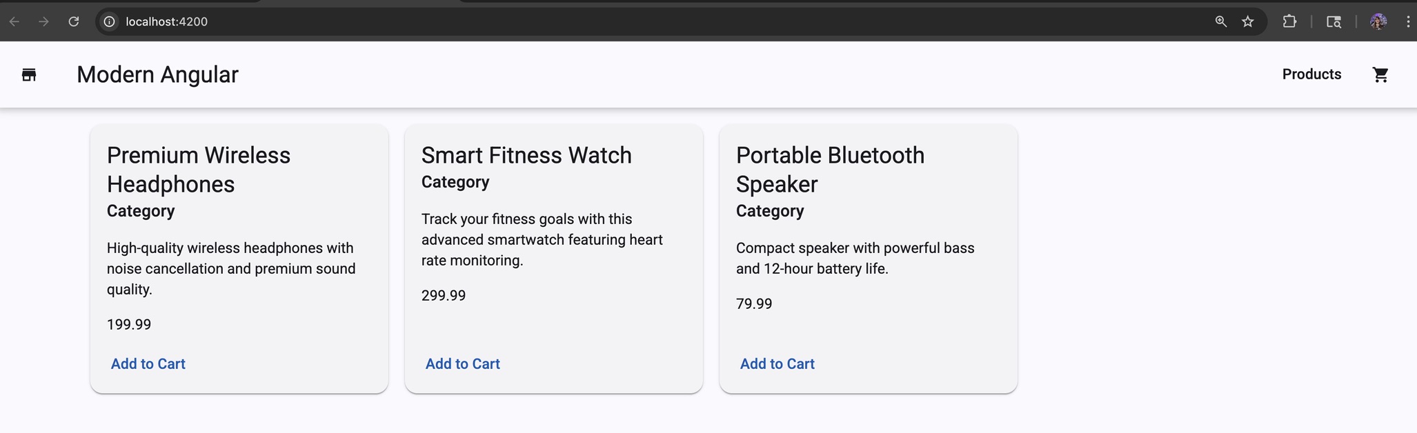
<mat-card-title>{{ product().name }}</mat-card-title>
<mat-card-subtitle>Product</mat-card-subtitle>
</mat-card-header>
<mat-card-content>
<p>{{ product().description }}</p>
<p class="price">{{ product().price | currency }}</p>
</mat-card-content>
<mat-card-actions>
<button matButton>Add to Cart</button>
</mat-card-actions>
</mat-card>
Notice we call product() in the template. That is because input() returns an input signal, and signals are read with parentheses — the same pattern we have been using since lesson 5.
Passing Data from Parent to Child
Now we connect the parent template to the child input.
File: products-grid.html
1
2
3
4
5
6
7
8
9
10
<div class="products-grid">
  @for (product of products(); track product.id) {
    <app-product-card [product]="product"></app-product-card>
  } @empty {
    <div class="empty-state">
      <h3>No products available</h3>
      <p>Check back later for new arrivals!</p>
    </div>
  }
</div>
The binding that connects everything:
1
[product]="product"
The left side is the child input name. The right side is the loop variable from the parent. Now each ProductCard instance gets one product object from the list.
Optional Inputs with Default Values
Required inputs are perfect for must-have data like product. But sometimes we want configurable behavior that can fall back to a default.
Let’s add an optional input to control the button label text.
File: product-card.ts
1
2
3
4
5
6
7
8
9
10
11
12
13
14
15
16
import { ChangeDetectionStrategy, Component, input } from '@angular/core';
import { MatButtonModule } from '@angular/material/button';
import { MatCardModule } from '@angular/material/card';
import { Product } from '../product';

@Component({
  selector: 'app-product-card',
  imports: [MatCardModule, MatButtonModule],
  templateUrl: './product-card.html',
  styleUrl: './product-card.scss',
  changeDetection: ChangeDetectionStrategy.OnPush,
})
export class ProductCard {
  readonly product = input.required<Product>();
  readonly addButtonLabel = input('Add to Cart');
}
Here, input('Add to Cart') means:
- This input is optional
- The default value is
'Add to Cart' - The parent can override it when needed
Now update the template to use it:
File: product-card.html
1
2
3
4
5
6
7
8
9
10
11
12
13
14
15
<mat-card class="product-card">
  <mat-card-header>
    <mat-card-title>{{ product().name }}</mat-card-title>
    <mat-card-subtitle>Product</mat-card-subtitle>
  </mat-card-header>

  <mat-card-content>
    <p>{{ product().description }}</p>
    <p class="price">{{ product().price | currency }}</p>
  </mat-card-content>

  <mat-card-actions>
    <button matButton>{{ addButtonLabel() }}</button>
  </mat-card-actions>
</mat-card>
And if you ever want to override the button text from the parent:
1
<app-product-card [product]="product" [addButtonLabel]="'View Details'"></app-product-card>
This makes the component more reusable without extra complexity.
Common Pitfalls
Two common mistakes to avoid:
- Forgetting parentheses in the template — writing
product.nameinstead ofproduct().name. Since inputs are signals, you must call them with()to read the value. - Marking important data as optional when it should be required — if the component cannot work without a piece of data, use
input.required<T>(). If it is configuration with a sensible default, useinput(defaultValue).
A good rule:
- If the component cannot work without it →
input.required<T>() - If it is configuration →
input(defaultValue)
Source Code
The full source code for the course is available on GitHub: loiane/modern-angular.
Next Step
In the next lesson, we build on this by adding conditional UI in the card using @if and @else to display sale prices and badges.
Watch the Video
This post is part of the Modern Angular Course series. Check the course page for the full episode list.