Modern Angular 08: Angular Material and Header Setup

This is lesson 8 of the Modern Angular Course. In the previous lessons, we covered Angular fundamentals and the full signals model — writable signals, computed signals, and effects. Now we shift towards building a real project, step by step, applying what we have learned and introducing new concepts along the way.
This post is part of the Modern Angular Course series. Check the course page for the full episode list.
In this post, we cover:
- The component structure we will build towards
- How to add Angular Material to the project
- Why Angular Material is a solid choice for Angular projects
- How to create a reusable header component
- How to use
AppComponentas the app shell - How standalone imports work in practice
Component Structure Overview
Before we start coding, let’s look at the component structure we are building towards for the home page.
We will have:
- A header component with the project title, a Products navigation link, and a cart icon
- A main content area that will eventually hold a products grid
- Product card components rendered inside the grid
There will be more components as the course progresses, but this is where we start. The key principles:
- Keep components as simple as possible
- Follow the DRY principle (Don’t Repeat Yourself)
- Each component should have a single responsibility
Adding Angular Material
Angular Material provides a CLI schematic that handles the installation and configuration for you. From the project root, run:
1
ng add @angular/material
During the setup, the schematic will ask you to:
- Choose a theme — pick one you like. If you are not sure, visit material.angular.dev to preview the options.
- Enable typography — select yes for consistent font styling.
The schematic takes care of:
- Adding
@angular/materialand@angular/cdkto your dependencies - Setting up global styles with the Material theme
- Configuring the Roboto font and Material Icons in
index.html
Once it finishes, the project has a consistent visual baseline. This is one of the advantages of using the schematic instead of configuring everything manually.
The Theme Configuration
After installation, the global styles.scss includes the Material theme setup:
1
2
3
4
5
6
7
8
9
10
11
12
13
@use '@angular/material' as mat;

html {
  height: 100%;
  @include mat.theme((
    color: (
      primary: mat.$azure-palette,
      tertiary: mat.$blue-palette,
    ),
    typography: Roboto,
    density: 0,
  ));
}
This configures the Material 3 design tokens for the entire application. You can customize the color palettes, typography, and density later as your design evolves.
Why Angular Material?
Angular Material gives us:
- Consistent UI components — buttons, toolbars, cards, and more, all following Material Design
- Accessibility by default — ARIA attributes, keyboard navigation, and screen reader support built in
- A complete design system we do not have to reinvent
For a real project, this allows us to focus on structure and behavior instead of building CSS from scratch.
From experience, I have used other popular UI frameworks where support was eventually discontinued. Angular Material is maintained by the Angular team itself, which makes it a safer choice for long-term projects.
Creating the Header Component
Let’s create the header component using the CLI:
1
ng generate component header
Or the shorthand:
1
ng g c header
This gives us header.ts, header.html, header.scss, and header.spec.ts — the same standalone component structure we have been using throughout the course.
The Header Component Class
The header component imports only the Material modules it needs:
1
2
3
4
5
6
7
8
9
10
11
12
import { Component } from '@angular/core';
import { MatToolbarModule } from '@angular/material/toolbar';
import { MatButtonModule } from '@angular/material/button';
import { MatIconModule } from '@angular/material/icon';

@Component({
  selector: 'app-header',
  imports: [MatToolbarModule, MatButtonModule, MatIconModule],
  templateUrl: './header.html',
  styleUrl: './header.scss',
})
export class Header {}
This is a modern Angular best practice: dependencies live where they are used. The header component declares exactly what it needs in its own imports array. No shared modules, no global module files.
The Header Template
Now let’s build the header UI using Material components:
1
2
3
4
5
6
7
8
9
10
11
12
13
14
15
<mat-toolbar class="main-header">
   <button matButton>
    <mat-icon aria-hidden="false" aria-label="Home" fontIcon="store"></mat-icon>
   </button>

   <span class="branding">Modern Angular</span>

   <span class="spacer"></span>

   <button matButton>Products</button>

   <button matButton>
    <mat-icon aria-hidden="false" aria-label="Cart" fontIcon="shopping_cart"></mat-icon>
   </button>
</mat-toolbar>
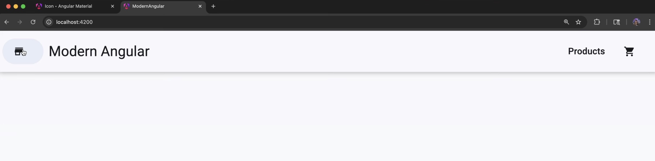
This gives us:
- A store icon as the home button
- A brand label with the project name
- A spacer that pushes the right-side content to the edge
- A Products navigation button
- A cart icon we will connect to cart functionality later
Header Styling
The styles are minimal — just enough to position the header and space the elements:
1
2
3
4
5
6
7
8
9
10
11
12
13
14
15
.spacer {
  flex: 1 1 auto;
}

.main-header {
  padding: 0 6px;
  position: relative;
  box-shadow: 0 1px 8px rgba(0, 0, 0, .3);
  z-index: 9;

  .branding {
    margin-left: 12px;
    font-weight: 600;
  }
}
The box-shadow gives the header a subtle elevation effect, and flex: 1 1 auto on the spacer pushes the Products button and cart icon to the right side of the toolbar.
Using AppComponent as the App Shell
Now let’s update the AppComponent to use the header and serve as the app shell. The template becomes:
1
2
3
<app-header />

<router-outlet />
And the component class imports Header:
1
2
3
4
5
6
7
8
9
10
11
12
13
import { Component, signal } from '@angular/core';
import { RouterOutlet } from '@angular/router';
import { Header } from './header/header';

@Component({
  selector: 'app-root',
  imports: [RouterOutlet, Header],
  templateUrl: './app.html',
  styleUrl: './app.scss'
})
export class App {
  protected readonly title = signal('modern-angular');
}
This reinforces an important concept: the root component is just another component. It composes other components together to form the application shell.
With everything in place, this is what the header looks like in the browser:
Source Code
The full source code for the course is available on GitHub: loiane/modern-angular.
Next Step
Now that we have Angular Material installed and a reusable header in place, we have a solid visual foundation. In the next lesson, we start building the Products UI — a product grid using Material cards with a clean component structure. From there, we will connect signals and real state.
Watch the Video
This post is part of the Modern Angular Course series. Check the course page for the full episode list.