Angular Reactive Forms: trigger validation on submit
In this article we will learn different approaches of validating all form fields when user clicks on submit button for Angular Reactive Forms. We will also learn how to disable the submit button if the form is invalid.
Contents
When working with forms we have 2 options: the first one is to disable the submit button if the form is invalid (meaning there is at least one invalid field) and the second option is to validate the form before the HTTP POST action is executed by the code and display a message to the user to fix any pending validation errors. Let’s take a look at these scenarios in the following sections.
For this example we will use Bootstrap (v3) framework for the CSS styles.
Disable the submit button if form is invalid
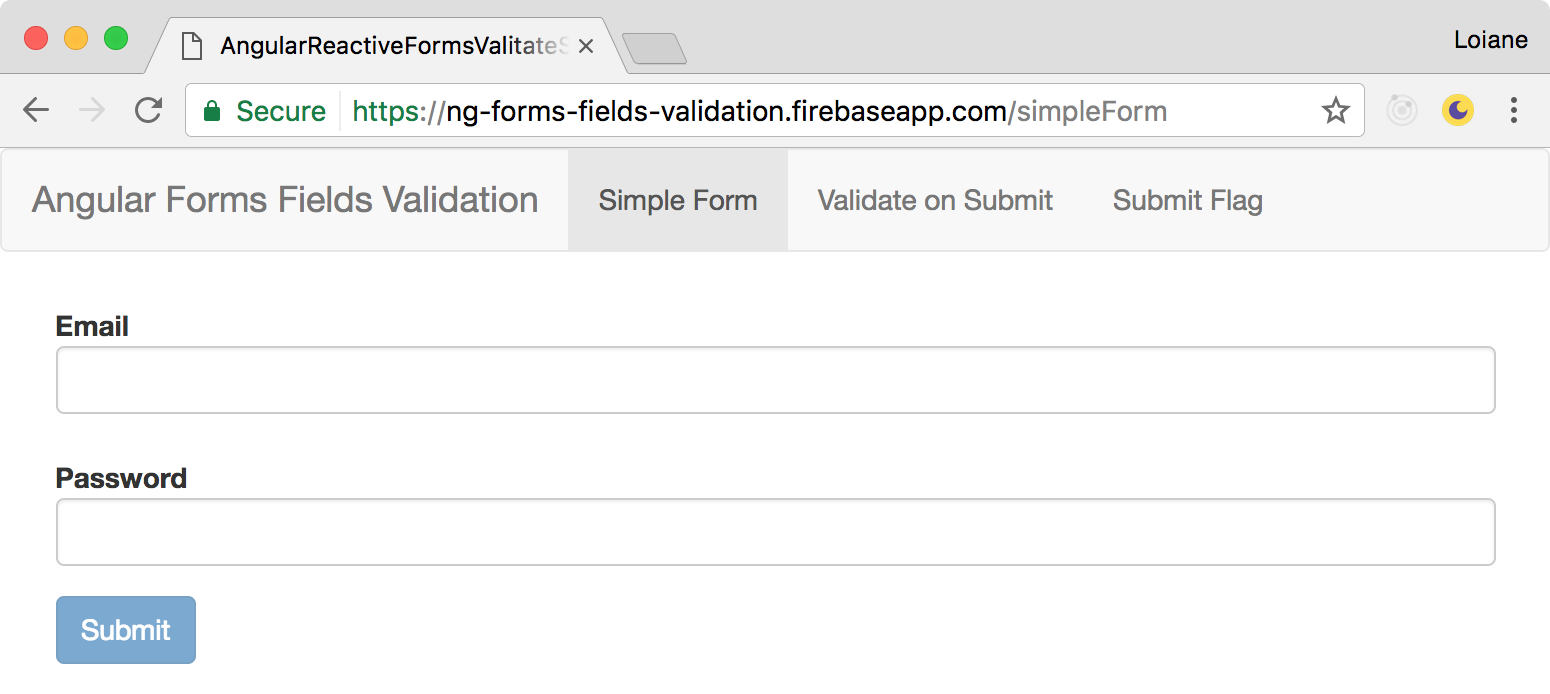
The first option we have when working with forms is to disable the submit button if the form is invalid. This approach is OK for very small forms such as login forms, where we only have 2 fields (user/email and password). It is easy for the user to guess it is needed to inform both fields before the submit button becomes available:
Let’s take a look at the code that renders the form above. It is the file simple-form.component.ts:
1
2
3
4
5
6
7
8
9
10
11
12
13
14
15
16
17
18
19
20
21
import { Component, OnInit } from '@angular/core';
import { FormGroup, FormBuilder, Validators } from '@angular/forms';

@Component({
  selector: 'app-simple-form',
  templateUrl: './simple-form.component.html',
  styles: []
})
export class SimpleFormComponent implements OnInit {

  form: FormGroup;

  constructor(private formBuilder: FormBuilder) { }

  ngOnInit() {
    this.form = this.formBuilder.group({
      email: [null, [Validators.required, Validators.email]],
      password: [null, Validators.required],
    });
  }
}
In the code above we have an Angular Reactive Forms with only 2 fields: email and password and both are required.
Now let’s take a look at the simple-form.component.html code:
1
2
3
4
5
6
7
8
9
10
11
12
13
14
15
16
17
18
19
20
21
<form class="form-horizontal" [formGroup]="form">

  <div class="form-group">
    <div class="col-sm-12">
      <label for="email" class="control-label">Email</label>
      <input type="text" id="email" class="form-control" formControlName="email">
    </div>
  </div>

  <div class="form-group">
    <div class="col-sm-12">
      <label for="password" class="control-label">Password</label>
      <input type="password" id="password" class="form-control" formControlName="password">
    </div>
  </div>

  <button type="submit" class="btn btn-primary" [disabled]="!form.valid">
    Submit
  </button>

</form>
The submit button will only be enabled if the form is valid ([disabled]="!form.valid"), meaning the email must be informed (and also must be a valid email) and the password also must be informed.
Please note that in this form we do not have any visual indicator that the email and password fields are required. We also do not display any validation error message. So the user have to guess that something is missing before the submit button is enabled.
However, specially when working with enterprise projects, we have forms with lots of fields. And disabling the submit form when the form is invalid is not appropriate. Let’s take a look at a different approach in the next example.
Trigger validation of all fields on submit
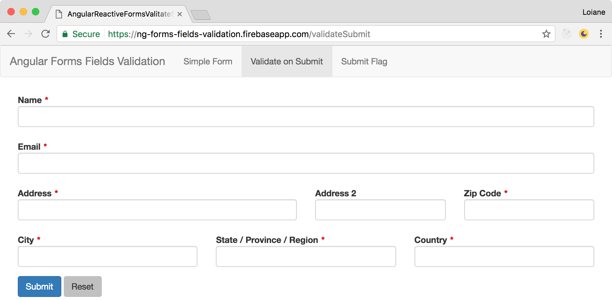
Let’s create a new form with some more fields. For this example, we will work on the validate-fields-submit-form.component.ts:
1
2
3
4
5
6
7
8
9
10
11
12
13
14
15
16
17
18
19
20
21
22
23
24
25
26
27
28
29
30
31
32
33
import { Component, OnInit } from '@angular/core';
import {
FormGroup,
FormBuilder,
Validators,
FormControl
} from '@angular/forms';
@Component({
selector: 'app-validate-fields-submit-form',
templateUrl: './validate-fields-submit-form.component.html',
styles: []
})
export class ValidateFieldsSubmitFormComponent implements OnInit {
form: FormGroup;
constructor(private formBuilder: FormBuilder) {}
ngOnInit() {
this.form = this.formBuilder.group({
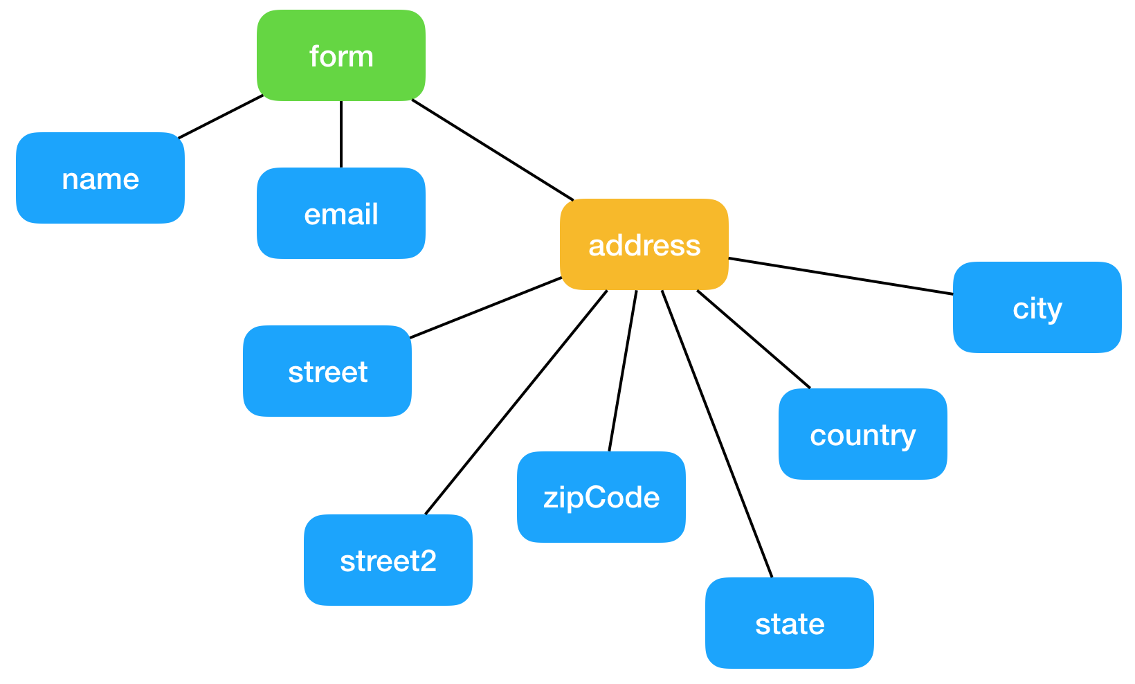
name: [null, Validators.required],
email: [null, [Validators.required, Validators.email]],
address: this.formBuilder.group({
street: [null, Validators.required],
street2: [null],
zipCode: [null, Validators.required],
city: [null, Validators.required],
state: [null, Validators.required],
country: [null, Validators.required]
})
});
}
}
In this form we have name, email and a set of address fields. Note that the fields related to the address are grouped under the form control named address.
Now let’s see the code for the template validate-fields-submit-form.component.html:
1
2
3
4
5
6
7
8
9
10
11
12
13
14
15
16
17
18
19
20
21
22
23
24
25
26
27
28
29
30
31
32
33
34
35
36
37
38
39
40
41
42
43
44
45
46
47
48
49
50
51
52
53
54
55
56
57
58
59
60
61
62
63
64
65
66
67
68
69
70
71
72
73
74
75
76
77
78
79
80
81
82
83
<form class="form-horizontal" [formGroup]="form">

  <div class="form-group" [ngClass]="displayFieldCss('name')">
    <div class="col-sm-12">
      <label for="name" class="control-label required">Name</label>
      <input type="text" id="name" class="form-control" formControlName="name">
      <app-field-error-display
        [displayError]="isFieldValid('name')"
        errorMsg="Please inform your name">
      </app-field-error-display>
    </div>
  </div>

  <div class="form-group" [ngClass]="displayFieldCss('email')">
    <div class="col-sm-12">
      <label for="email" class="control-label required">Email</label>
      <input type="text" id="email" class="form-control" formControlName="email">
      <app-field-error-display
        [displayError]="isFieldValid('email')"
        errorMsg="Please inform your email">
      </app-field-error-display>
    </div>
  </div>

  <div formGroupName="address">
    <div class="form-group">
      <div class="col-md-6" [ngClass]="displayFieldCss('address.street')">
        <label for="street" class="control-label required">Address</label>
        <input type="text" id="street" class="form-control" formControlName="street">
        <app-field-error-display
          [displayError]="isFieldValid('address.street')"
          errorMsg="Please inform your address">
        </app-field-error-display>
      </div>

      <div class="col-md-3">
        <label for="street2" class="control-label">Address 2</label>
        <input type="text" id="street2" class="form-control" formControlName="street2">
      </div>

      <div class="col-md-3" [ngClass]="displayFieldCss('address.zipCode')">
        <label for="zipCode" class="control-label required">Zip Code</label>
        <input type="text" id="zipCode" class="form-control" formControlName="zipCode">
        <app-field-error-display
          [displayError]="isFieldValid('address.zipCode')"
          errorMsg="Please inform your zip code">
        </app-field-error-display>
      </div>
    </div>

    <div class="form-group">
      <div class="col-md-4" [ngClass]="displayFieldCss('address.city')">
        <label for="city" class="control-label required">City</label>
        <input type="text" id="city" class="form-control" formControlName="city">
        <app-field-error-display
          [displayError]="isFieldValid('address.city')"
          errorMsg="Please inform your city">
        </app-field-error-display>
      </div>

      <div class="col-md-4" [ngClass]="displayFieldCss('address.state')">
        <label for="state" class="control-label required">State / Province / Region</label>
        <input type="text" id="state" class="form-control" formControlName="state">
        <app-field-error-display
          [displayError]="isFieldValid('address.state')"
          errorMsg="Please inform your state">
        </app-field-error-display>
      </div>

      <div class="col-md-4" [ngClass]="displayFieldCss('address.country')">
        <label for="country" class="control-label required">Country</label>
        <input type="text" id="country" class="form-control" formControlName="country">
        <app-field-error-display
          [displayError]="isFieldValid('address.country')"
          errorMsg="Please inform your country">
        </app-field-error-display>
      </div>
    </div>
  </div>

  <button class="btn btn-primary" (click)="onSubmit()">Submit</button>
  <button class="btn" (click)="reset()">Reset</button>
</form>
Since we are using Boostrap classes in our project, each form-group is a row of our form. For the fields we want to occupy an entire row we can use the class col-sm-12 (part of the Bootstrap grid system). For the fields we want a more complex layout (street, street2 and zipCode), we can wrap the fields in a form-group DIV and we can use the classes col-md-6, col-md-3, col-md-* to set the width that each field will ocuppy (just remember that the sum of the col-md-X needs to be 12). The address fields are also wrapped in a DIV <div formGroupName="address"> so the reactive control group can be linked to the HTML template form as well.
Displaying Bootstrap validation styles
Boostrap 3 has built in validation styles for form fields.
For error styles, it consists in adding has-error class along with form-group class. We can also add icons by adding the class has-feedback.
For this example, we will consider a field has validation error when the field is not valid and it has been touched (meaning it has received focus). Please check the references at the end of this post for more information about the states of form controls.
We can use Angular ngClass directive to display the validation styles in our form fields:
1
2
3
4
5
<div class="form-group"
  ngClass="{
      'has-error': !form.get('name').valid && form.get('name').touched,
      'has-feedback': !form.get('name').valid && form.get('name').touched
  }">
Now imagine doing this for all 7 fields of our small form? We are going to repeat a lot of code. Instead, we are going to create some helper functions in our ValidateFieldsSubmitFormComponent.
You can also create a Helper or Util class in your project with these functions so you do not repeat the code in all your form components or you can create a super/base form class and use Angular inheritance.
1
2
3
4
5
6
7
8
9
10
isFieldValid(field: string) {
  return !this.form.get(field).valid && this.form.get(field).touched;
}

displayFieldCss(field: string) {
  return {
    'has-error': this.isFieldValid(field),
    'has-feedback': this.isFieldValid(field)
  };
}
And in our HTML template we simply call displayFieldCss passing the name of the form control (field):
1
[ngClass]="displayFieldCss('name')"
Just remember that if you have nested controls you need to pass the complete path of the control:
1
[ngClass]="displayFieldCss('address.street')"
Displaying the validation error message
To display the validation error message of each field and also the X icon when the field is invalid we can create a presentational component (or dumb component).
In the field-error-display.component.ts we will have the following Input properties:
1
2
3
4
5
6
7
8
9
10
11
import { Component, OnInit, Input } from '@angular/core';

@Component({
  selector: 'app-field-error-display',
  templateUrl: './field-error-display.component.html',
  styleUrls: ['./field-error-display.component.css']
})
export class FieldErrorDisplayComponent {
  @Input() errorMsg: string;
  @Input() displayError: boolean;
}
And in the field-error-display.component.html template:
1
2
3
4
5
6
7
<div *ngIf="displayError" >
  <span class="glyphicon glyphicon-remove form-control-feedback fix-error-icon"></span>
  <span class="sr-only">(error)</span>
  <div class="error-msg">

  </div>
</div>
And some styles:
1
2
3
4
5
6
.error-msg {
  color: #a94442;
}
.fix-error-icon {
  top: 27px;
}
In each of our form controls (fields) we can simply use the following code to display the error messages:
1
2
3
4
<app-field-error-display
  [displayError]="isFieldValid('name')"
  errorMsg="Please inform your name">
</app-field-error-display>
Much better then repeating the Bootstrap code 7 times in our small form!
Displaying the required field asterisk (*)
To display the red asterisk in each field using Bootstrap styles, we can use the following CSS:
1
2
3
4
5
6
7
.control-label.required:after {
  color: #d00;
  content: "*";
  position: absolute;
  margin-left: 5px;
  top:7px;
}
Then, in the labels of the required fields we can add the class required along with the Boostrap label class control-label.
Angular does not have a way of retrieving if a form control is required programatically. There is an open issue about this topic. For this reason we need to apply the
requiredclass manually in all labels. Or you can code a separate logic that will retrieve all required fields right after the form is created/initialized.
Now the user has visual indicators for some required fields, but still can miss a field or other and click on the submit button anyway. So let’s go to the next step.
Validating all fields on submit
When we click on the submit button, we want to submit the form only if it is valid. If it is not valid, we want to display the validation errors so the user is able to fix them before submiting the form again:
1
2
3
4
5
6
7
onSubmit() {
  if (this.form.valid) {
    console.log('form submitted');
  } else {
    // validate all form fields
  }
}
To validate all form fields, we need to iterate throughout all form controls:
1
2
3
4
Object.keys(this.form.controls).forEach(field => { // {1}
  const control = this.form.get(field);            // {2}
  control.markAsTouched({ onlySelf: true });       // {3}
});
Angular does not have a method or function that we can use to iterate each control, so we will use Object.keys from EcmaScript to retrieve all the keys from the form ({1}). Each key is just the name of the control, so we need to retrieve the control object ({2}), and then, we can mark the control as touched ({3}) to trigger the validation.
Just remember that in this example we are using the expression
!this.form.get(field).valid && this.form.get(field).touchedfor invalid fields. If you use other status such asdirty(meaning the control value has changed) to validate the control, then you need to ajust the logic above accordingly.
If we execute the code now, we will notice that only the name and email will have validation errors. This is because the code above will only work if you do not have FormGroups. If you have a form with nested controls, then we will need a different logic. So let’s refactor and move the code above into a method:
1
2
3
4
5
6
7
8
9
10
validateAllFormFields(formGroup: FormGroup) {         //{1}
  Object.keys(formGroup.controls).forEach(field => {  //{2}
    const control = formGroup.get(field);             //{3}
    if (control instanceof FormControl) {             //{4}
      control.markAsTouched({ onlySelf: true });
    } else if (control instanceof FormGroup) {        //{5}
      this.validateAllFormFields(control);            //{6}
    }
  });
}
A Reactive Form is an instance of FormGroup ({1}). So our method will receive the reference of the form. We will iterate throughout each key of the form ({2}) and will retrieve the control object ({3}). Now comes the important part. A form can have a FormControl, which we can say it is a field or it can have a FormGroup, which is a group of fields. If it is a field ({4}), then we mark the control as touched (or dirty according to the logic applied in your project). If it is a group of fields ({5}), then we need to call the same method again ({6}) until all levels of the form controls have been validated.
In case you need to handle validation messages for the FormControls as well, you can modify the code to also mark the FormGroup as touched by simply removing the
{ onlySelf: true }parameter. When we passonlSelf: trueto themarkAsDirtyormarkAsTouch(or other markAs* methods) Angular only marks the control itself. Without this option, Angular will mark the control and its parent.
In the onSubmit method we will call the validateAllFormFields ({7}) passing the form to the method.
1
2
3
4
5
6
7
onSubmit() {
  if (this.form.valid) {
    console.log('form submitted');
  } else {
    this.validateAllFormFields(this.form); //{7}
  }
}
An Angular Reactive Form is like the tree data structure. Each FormControl is a leaf and each FormGroup is a node with children. The root node is the form reference itself. So to traverse a form and visit all its controls we need a recursive method passing the root as starting node:
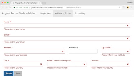
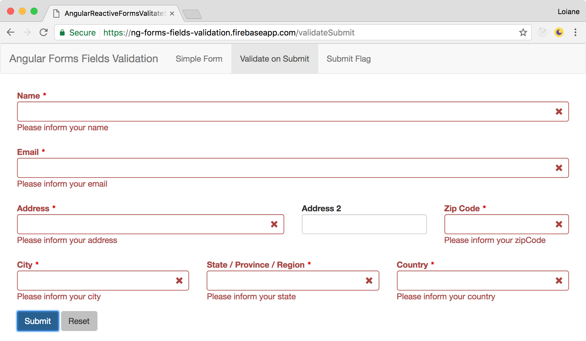
If we click on the submit button we will trigger the validation and the validation error messages will be displayed on the page:
The code we developed for this example can be used in any Angular Reactive Form. The only thing that might be different is how the CSS framework you chose to use in your project handles the validation styles applied to each form control.
Attempt to submit flag instead of marking the control as touched/dirty
There is a simpler way of achieving the same result as our second example without iterating all the form controls and marking them as touched (or dirty).
Our third example consists in creating a flag to control when the user attempts to submit the form.
The HTML code is the same as the second example, so we’ll focus only on the component Angular/TypeScript code for the submit-flag-form.component.ts.
First, we need to declare a boolean atribute:
1
private formSubmitAttempt: boolean;
We will also change the logic for the onSubmit method:
1
2
3
4
5
6
onSubmit() {
  this.formSubmitAttempt = true;
  if (this.form.valid) {
    console.log('form submitted');
  }
}
Whenever the user tries to submit the form, we will flag formSubmitAttempt as true. This way, we do not need to execute the validateAllFormFields method from the previous example.
Since we have a new variable to help us verifying if we need to display the validation messages or not, we also need to change the expression that returns if a field is valid or not:
1
2
3
4
isFieldValid(field: string) {
  return (!this.form.get(field).valid && this.form.get(field).touched) ||
    (this.form.get(field).untouched && this.formSubmitAttempt);
}
In this case, we add a new condition to the field validation. If the user attempts to submit the form and the field has not been touched, then the validation error messages will be displayed on the HTML template.
It is important to combine the formSubmitAttempt with the oposite state we used in the first part of the condition. For this example it is touched and untouched, but if you use dirty for the first condition, you need to combine formSubmitAttempt with the control pristine state.
And at last, when the user clicks on the reset button:
1
2
3
4
reset() {
  this.form.reset();
  this.formSubmitAttempt = false;
}
The form will be reseted (values will be reseted to their initial value and the control states touched, dirty and invalid will be unmarked) - and the flag the attempt will receive value false so the validation messages can be hidden/removed from the page.
Both examples have the same output, however, we were able to achieve the same result with less lines of code in the second example.
Source code and live demo
Source code available on GitHub
References:
- Angular Forms guide
- Angular Forms control state
- Angular AbstractControl class API
- Bootstrap 3 Form CSS
- Bootstrap 3 Grid System
Happy coding!